Difference between revisions of "Shadow Ticket cover analysis"
| Line 5: | Line 5: | ||
The Penguin Press U.S. edition uses Helvetica Neue for both the title and author, and a cursive italic script (which I can't identify) for "A Novel." The Penguin/Jonathan Cape U.K. edition uses “Moonlit Night JNL” by Jeff Levine for the title and author, unslanted, and without "A Novel." | The Penguin Press U.S. edition uses Helvetica Neue for both the title and author, and a cursive italic script (which I can't identify) for "A Novel." The Penguin/Jonathan Cape U.K. edition uses “Moonlit Night JNL” by Jeff Levine for the title and author, unslanted, and without "A Novel." | ||
| − | <h3> | + | <h3>Photography</h3> |
[[File:Nagymezö-Street-1930.jpg|350px|thumb|''1930 - 1940, Nagymező utca, a pesti Broadway''<br />Source: Gyökhegyi Bánk / [https://www.ilyenisvoltbudapest.hu/keruletek/vi-kerulet/1930-1940-nagymezo-utca-a-pesti-broadway Ilyen is volt Budapest]|left]]According to the website where this photo was obtained, [https://www.ilyenisvoltbudapest.hu/keruletek/vi-kerulet/1930-1940-nagymezo-utca-a-pesti-broadway Ilyen is volt Budapest] (Trans: "This is what Budapest was like"): | [[File:Nagymezö-Street-1930.jpg|350px|thumb|''1930 - 1940, Nagymező utca, a pesti Broadway''<br />Source: Gyökhegyi Bánk / [https://www.ilyenisvoltbudapest.hu/keruletek/vi-kerulet/1930-1940-nagymezo-utca-a-pesti-broadway Ilyen is volt Budapest]|left]]According to the website where this photo was obtained, [https://www.ilyenisvoltbudapest.hu/keruletek/vi-kerulet/1930-1940-nagymezo-utca-a-pesti-broadway Ilyen is volt Budapest] (Trans: "This is what Budapest was like"): | ||
Latest revision as of 16:11, 2 October 2025
Design
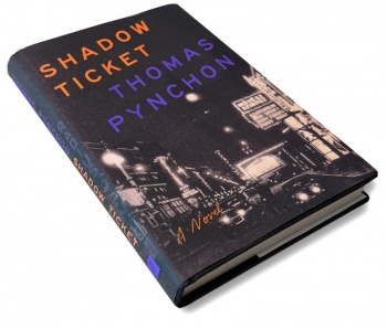
The dust jacket design for the Penguin Press U.S. edition of Shadow Ticket follows the template created for Inherent Vice (2009) and continued with Bleeding Edge (2013) i.e., upward-slanting sans-serif typography for the title and author with an image, appropriate to the "vibe" of each novel, in the background. This makes sense given that all three of these novels are similar in style — surreal detective/noir fiction, with a distinctly "Pynchonian" character — dense, allusive, satirical, and paranoid. So visually branding them creates a unity that feels right.
Typography
The Penguin Press U.S. edition uses Helvetica Neue for both the title and author, and a cursive italic script (which I can't identify) for "A Novel." The Penguin/Jonathan Cape U.K. edition uses “Moonlit Night JNL” by Jeff Levine for the title and author, unslanted, and without "A Novel."
Photography
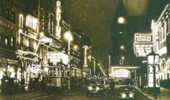
According to the website where this photo was obtained, Ilyen is volt Budapest (Trans: "This is what Budapest was like"):This is more or less what Nagymező Street looked like around 1930 – no coincidence it was called the Broadway of Pest. On the right stood the Művész Színház (today’s Operetta Theatre), on the left the Radius Cinema (today’s Thália Theatre). In the Mai Manó House was the Arizona nightclub. Alongside cars, the No. 10 tram also ran down the street. As for the street’s name over the years: from the 1720s it was Feld Gasse, from 1853 Grosse Feld Gasse, and from 1874 it has been known as Nagymező Street
Gyökhegyi Bánk, a Hungarian photo collector/archivist-type contributor, is credited as the source for this photograph.

