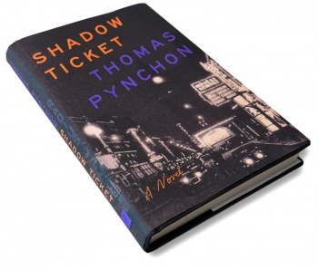
Shadow Ticket cover analysis
Design
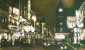
The dust jacket design for the Penguin Press U.S. edition of Shadow Ticket follows the template created for Inherent Vice (2009) and continued with Bleeding Edge (2013) i.e., upward-slanting sans-serif typography for the title and author with an image, appropriate to the "vibe" of each novel, in the background. This makes sense given that all three of these novels are similar in style — surreal detective/noir fiction, with a distinctly "Pynchonian" character — dense, allusive, satirical, and paranoid. So visually branding them creates a unity that feels right.
Typography
The Penguin Press U.S. edition uses Helvetica Neue for both the title and author, and a cursive italic script (which I can't identify) for "A Novel." The Penguin/Jonathan Cape U.K. edition uses “Moonlit Night JNL” by Jeff Levine for the title and author, unslanted, and without "A Novel."

